Direct The Eye – Telling the Viewer Where to Look
By Maggie Hood
We are constantly absorbing information and imagery. From magazines and books to websites and social media, we are bombarded with images constantly. The endless scrolling we do on our phones has us looking at 100s of images in a matter of minutes. With so much to look at, what will make us stop and really look at an image? Something in the image needs to grab the viewer. It isn’t until you have the attention of the viewer that you can tell them a story and make them feel something. It could be a documentary image of a wedding where the groom is crying happy tears, making us feel joy. It could be an image of a mountain range that makes us feel adventurous. It could be a portrait of someone we don’t know, but it makes us feel intrigued and interested. But how can we make sure that the viewer of our images is observing what we would like them to see? We can tell them where to look by grabbing their attention visually.
When we first look at an image, we are usually drawn to one particular part of the image. And then hopefully, we’re led through the image and finally take it in as a whole. I believe that strong images tell us where to look. There can be a lot going on in the image, but at first glance, it will pull us to one particular part of the image. So what are some ways to tell a viewer where to look?
Colour
Colour is a valuable tool to direct the eye in an image. In a sea of green leaves, one orange leaf is going to pop and draw our attention. From there, we can discern that it is the beginning of fall and the leaves are starting to change colour. Another example would be the brightly coloured jacket of a mountain climber in the white show, as we’re immediately drawn to that pop of colour in the white landscape.
Using colour to draw the attention of the viewer is a valuable tool to direct attention. Adding a pop of colour can be as simple as having a subject wear brightly coloured attire that stands out from their surroundings or photographing a brightly coloured door on a monochromatic street.
Image by Maggie Hood
Composition
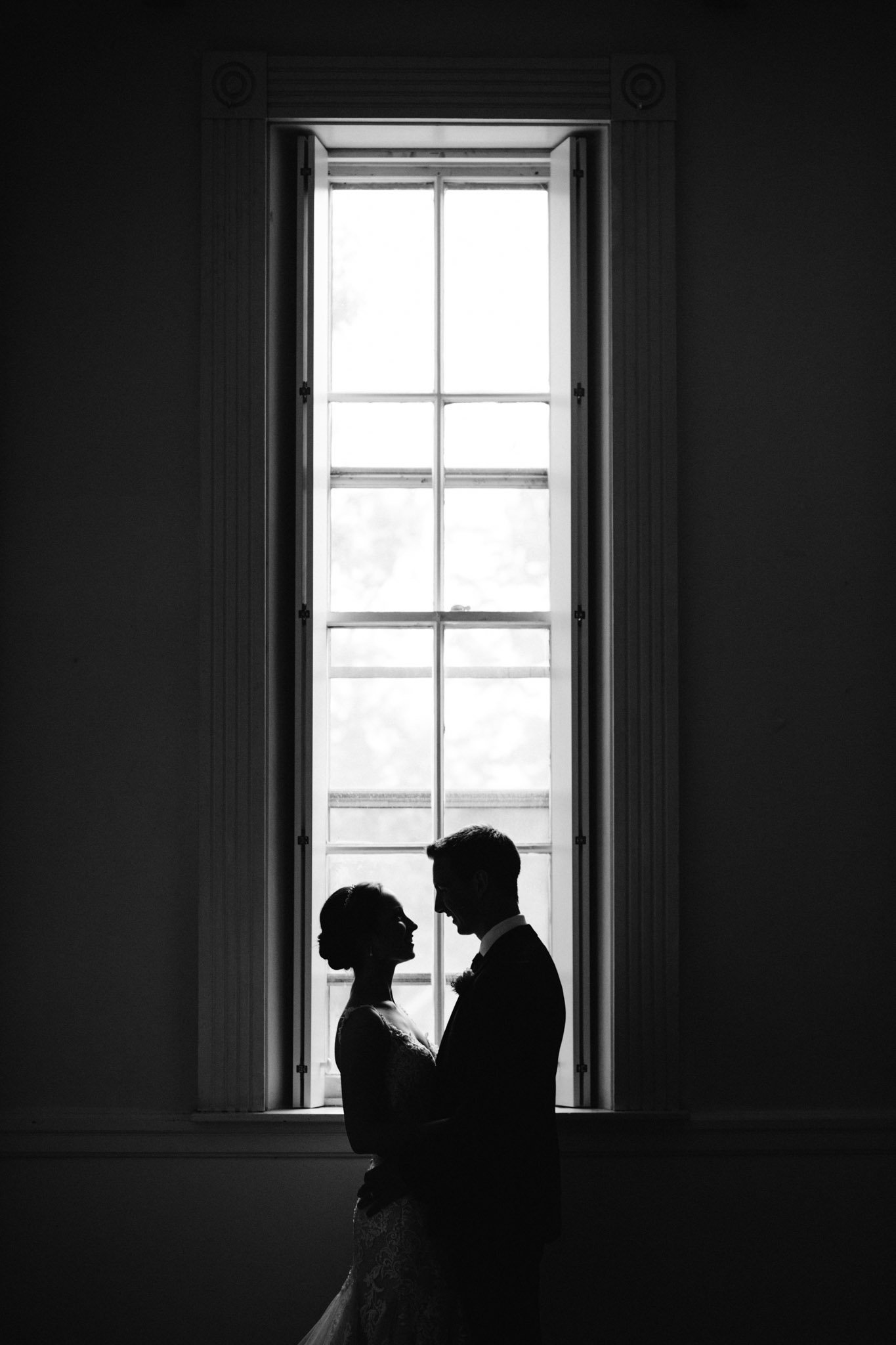
There are many different ways to compositionally draw the eye. The most popular, which I’m sure you’ve already heard of is the rule of thirds. Beyond that, a couple of my favourites are leading lines and framing. Leading lines will pull you into the image and lead you to where the artist wants you to look. It can be as simple as following footsteps in the snow or sand, or following train tracks into the image. Framing your point of interest is another useful tool. You can be as literal as using a window frame or even using buildings and alleyways to create a frame around your subject.
Image by Maggie Hood
Depth of Field
One of the simplest ways you can tell the viewer where to look is using depth of field. You can blur the areas around the subject and keep your subject sharp. This works for portrait photography, but also in landscapes if you’re focussing on a flower in the foreground with the mountains in the background slightly blurred for example. Leveraging depth of field is probably one of the most used strategies in portrait photography, as photographers love to shoot at wide apertures to isolate their subjects from the background.
Image by Maggie Hood
Light/Contrast
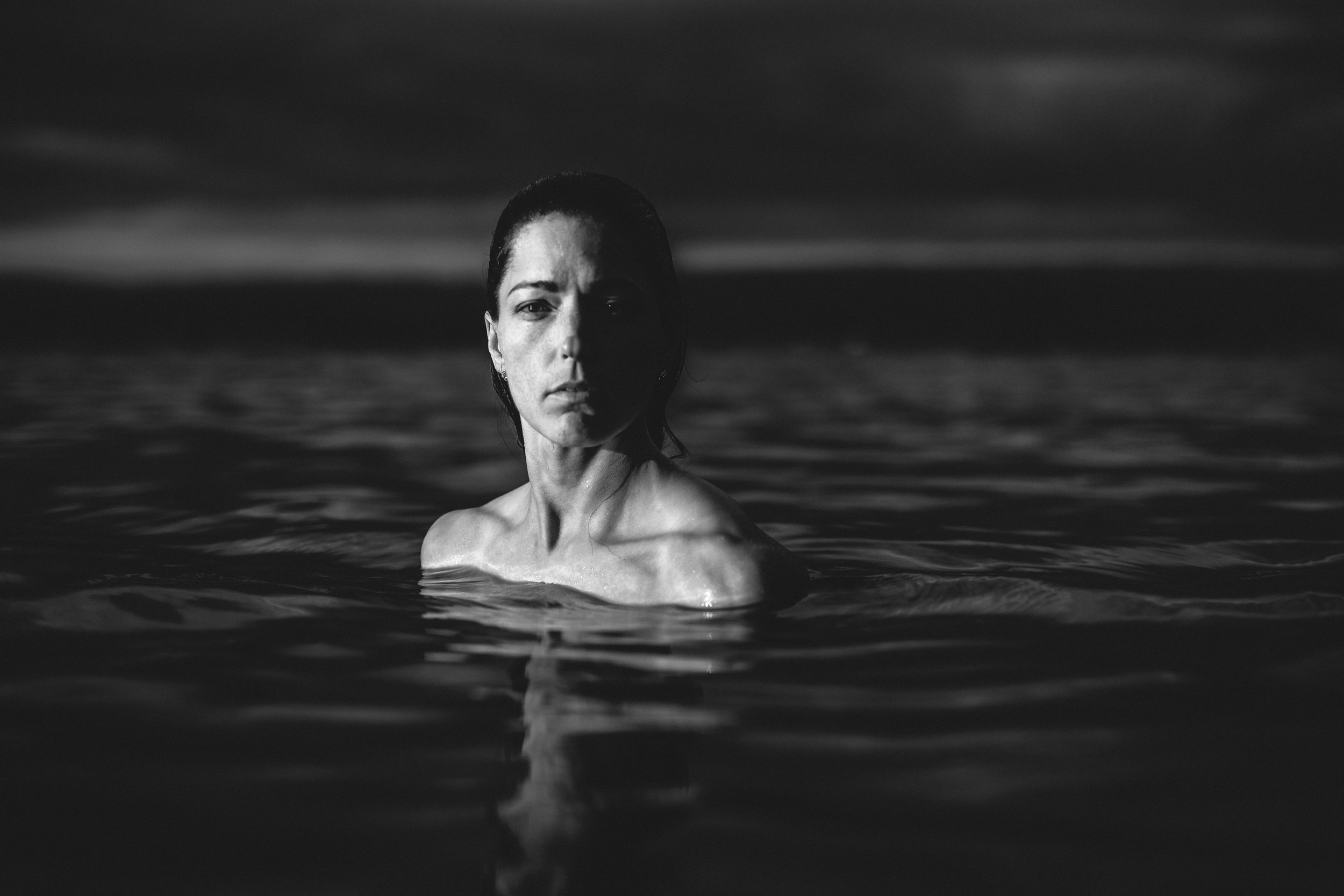
We are naturally drawn to the lightest part of a dark image and the darkest part of a light image. This is something we can leverage to catch the viewer’s attention. A well lit portrait will tell you exactly where in the image they want you to look and also set the mood. It can be light and airy or moodier, using light to isolate the subject from a dark background. I love to see a nice pop of light on the subject to isolate them from their surroundings. You don’t need to use artificial lighting and can sometimes leverage available light, such as positioning a portrait subject in directional window light or using direct sunlight.
Image by Maggie Hood.
Individually, each of these strategies can be a powerful way of catching the viewer’s attention. Collectively, using one or more can take an image to the next level. I invite you to examine some of your favourite images (your own or from other photographers) and evaluate how the artist is grabbing your attention visually. My bet is that you'll find at least one or more of these strategies.
Maggie Hood is a portrait and wedding photographer and a Contributor to OFFBEAT.
This article was originally written for our private OFFBEAT Community. Join us!


